Tips and tricks to design slides and adapt publication figures for scientific presentations
Scientists presenting their data almost always start by introducing their topic and then move on to showing the collected data. The high level of technical information often produces slides cluttered with intricate plots which makes it difficult to follow the presentation.
There are essential steps that should precede any attempts to design a presentation, like considering the targeted public, choosing the core message and crafting a narration, all of which are described in detail elsewhere.
From the point of view of design however, simple tricks exist that always improve the clarity of your presentation slides:
- choose a font and colour scheme for your slides (1-2 main fonts and 2-3 main colours plus their shades) and be consistent in using them throughout the entire presentation;
- assure the best contrast between foreground and background elements. Colour combinations like dark blue on black or yellow on white do not provide enough contrast. Personally, I prefer the combination of a clear background with dark, nearly black text but a dark background and light colour for text and figures is providing an equally good contrast. If you choose a dark background for your slides and need to invert the colour scheme of your publication figures, make sure the resulting colours contrast well with the background. On a darker background, light elements look more slender so increasing the font and line widths may be a good idea as well;
- avoid “boxed” figures: for example, a rectangular white background surrounding a plot on a black slide will always appear very distracting. The best is to remove the figure background entirely, however do it only if you have access to the native format and the software with which it was created. If that is not the case soften the edges by, for example, rounding or blurring them. Simply cutting out background colour pixels from raster images is usually producing very poor quality images and hence, not recommended. You can also consider showing the figure at the full slide size which can remove the problem of edges completely. Check however if your figure has a good enough resolution for that;
- if showing movies, the rule of thumb is one movie per slide. As for figures, if there is a colour difference between the slide and movie backgrounds and if the movie resolution allows it, show it at full slide size to avoid visible edges;
- less text is almost always a good idea: the slide is there to corroborate the story told by you. It is not there to have your audience read the text instead of listening to you. Ideally slides should tell your story through shown images with a minimal amount of additional text. Obviously this does not concern legends and labels that are necessary for understanding;
- image resolutions of 96 – 150 ppi are completely sufficient for slides. If you use paper figures that are intended for print with 300 ppi or higher, reduce their resolution as a high resolution does not give you any advantage on a screen. This will also keep your presentation size reasonable. Additionally, if the figure colour settings are CMYK (suitable for print purposes but sometimes problematic on screen), convert it to RGB.
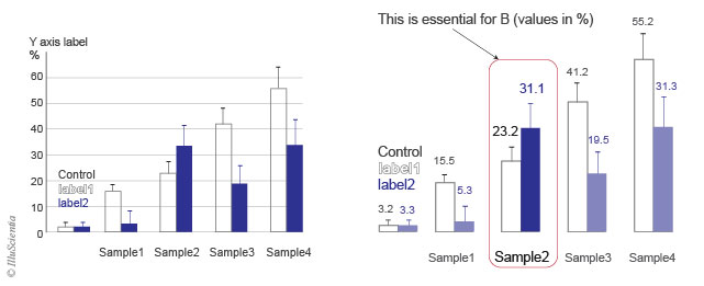
Always adapt your publication figures for your presentations. Whatever the origins of the figure, it should match the font/ colour scheme used in your current presentation: if it is a figure taken from a different presentation, be sure to adapt its font/ colour scheme accordingly. It is really worth the effort. See section on plots and figures for presentations, pp. 9-12 in “Graphic design for scientists and researchers”.

A selection of further sources:
Short Introduction to slide design by M. Alley
1h lecture by J.L. Doumont on creating effective slides: Design, Construction, and Use in Science– you can start at 15 min to delve right in.
Pimp your slides : scroll down for examples of slide makeovers.
The floor is yours: Blog on designing compelling scientific presentations.
Muse of Fire: Storytelling & The Art of Science Communication aims to provide a ready reference for scientists, engineers, doctors, entrepreneurs. The book pp.20 to 70 in particular give a comprehensive overview of a presentation design starting from considering your audience, choosing your core message and crafting your narration.
If you like the content of this blog, sign up to receive the latest posts on graphic design for scientists directly to your inbox!
