Image formats and composition. Golden ratio and rule of thirds in scientific illustration.
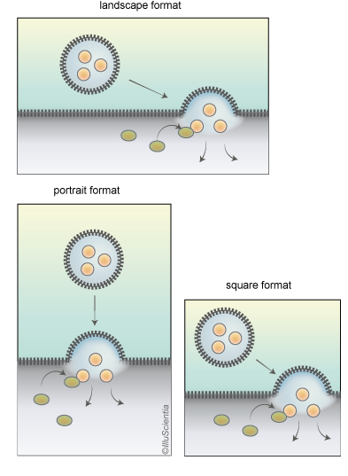
The choice of the format depends on the type of communication, the space, and the message you want to deliver. If you prepare a presentation, you work mostly on slides with the landscape format. Posters are typically in portrait format but can also be in landscape or square format. Publication figures or plots can have many different formats. When you have the choice of the format, consider this:
- Landscape format (width:height >1) is perfect for presenting a general overview, a sequence of events or a plot. Landscape format presents the facts in a sweeping, peaceful manner.
- Portrait format (width:height < 1) presents the message in a more dynamic, sometimes even dramatic manner. You can stress, for example, how dramatically your measure increases / decays over time by using the verticality of this format. The portrait format lends itself well to highlight the dynamic and / or exceptional nature of what you observed / measured.
- Square format (width=height) is fairly neutral compared to portrait but can prove a bit more crowded and less balanced than landscape. It is a good choice if you lack space for the landscape format.
For special cases, less common formats can be adopted. For example, circular format is naturally suitable for presenting things of cyclic nature.

Image composition: golden ratio and rule of thirds.
It has been fascinating people for centuries, if not millennia. In 2010, the journal Science reported that it is present even at the atomic scale in the magnetic resonance of spins in cobalt niobate crystals. The golden ratio.
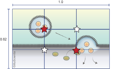
When two dimensions are in the ratio of approximately 1.618 they are in so called golden ratio. If it is used in image composition, it is said to yield a pleasing harmonious result. In the example below, the format width to height ratio is 1.62.
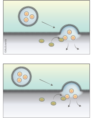
Another rule, maybe a bit less famous, is the rule of thirds. According to it, to create an interesting, dynamic composition, instead of simply centring the subject within the composition boundaries, divide the available space into nine equal parts by drawing two equally spaced horizontal lines and two equally spaced vertical lines. The important compositional elements should be placed along these lines or their intersections. As you see, the vesicles in the figure below are in the vicinity of the line intersections and the dashed line is aligned with the lower horizontal grid line.

Compare the figure adhering to the rule of thirds (upper image) with its analog ignoring it (bottom image):

If you like the content of this blog, sign up to receive the latest posts on graphic design for scientists directly to your inbox!
