How to quickly transform an existing publication figure into an image for general public.
Let’s say you have a bigger scientific publication coming out soon and you would like to have an image to share together with the news of your results. This may be a classical press release or a note on your personal website or, what is more and more common, a post on your blog or social network platforms like Facebook, Twitter, Pinterest… The latter is a great way to engage with people interested in your research and it is very image hungry!
Below, I show a case study how to quickly prepare an image for precisely this purpose!
I already hear you say: I spend enough time preparing figures for the paper itself, I will just use one of these! Well, that’s usually not a good idea and here’s why: you have a completely different audience for your paper (specialists) than for your press release (science interested non-specialists). Moreover, figures in publications are usually in need of the context provided by the text, whereas figures for general public should be largely self-explanatory and visually attractive enough on its own.
There are essentially two types of images that can be used in this context. The first is a “narrative” one: it will tell a story to the viewer about your discovery or visually sum up the main hypothesis. The second type is a “presentation” image: an image, for example, of an atomic structure of a newly described crystal, of a new device or a zoom into a micrograph revealing an interesting pattern or texture. Depending on your publication, you may want to go for a “narrative” or a “presentation” type of image. Keep in mind that a “narrative” image is usually more time consuming to make but also more educational for your audience. “Presentation” image, on the other hand, can be visually very strong and more effective in attracting attention.
Case study: transforming an existing figure into a “narrative” illustration.
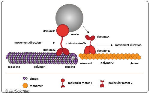
Starting out from a typical publication figure:

- remove all labels, arrows, legends and any text that is meant for other scientists in your field (scale bars can stay if relevant);
- rework your composition. Whereas in a schematic figure you usually stick to representations that are very simple, often symmetrical, devoid of any perspective and fancy arrangements, here on the contrary you can scratch your creative itch. Try, for example, to look for interesting points of view, angles, diagonals or add a bit of perspective view… In general, avoid too many symmetrical elements and arrangements and take also into account the image format, the golden ratio and the rule of thirds;
- add background which can be uniform or more nuanced depending on what you like, its purpose is to give cohesion to the whole picture but not dominate it;
- play with colour choices, try colour gradients (position them off centre), adopt more complex appearances, add textures, introduce irregularities, in short, make the picture “richer” in details to dwell on;
- you can further add special effects like shadowing, halos, glows and similar. However be critical and don’t overdo it. Get inspired by images that you find pleasing! Don’t forget to have fun with it!
The gif below summarizes the whole process and shows the outcome:

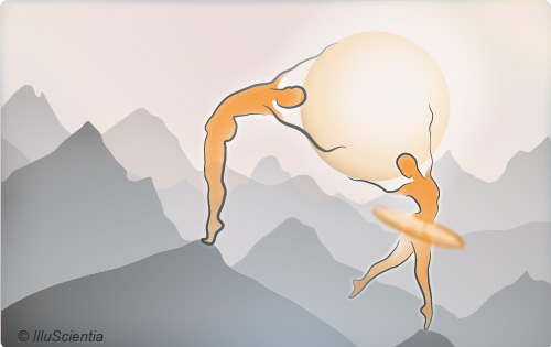
As a side note, there is another type of images that are useful in this context: conceptual images that convey your message in a metaphorical way. For the illustration shown above, I have created this imaginary landscape with two ballet dancers (but possibilities are boundless):

These images can be often sourced from the internet. If you find an image that suits you, check that it is released under creative commons licence or, if it is copyrighted, ask for permission to use it. Cite the image source.
If you like the content of this blog, sign up to receive the latest posts on graphic design for scientists directly to your inbox!
