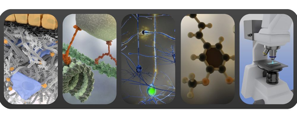
Graphical abstracts for scientific publications: as simple as possible but not simpler.
Graphical abstracts for scientific publications in the form of a single, concise image have been around for a relatively short time, starting in 2009 to the best of my knowledge. Most of the time they are intended only for the online synopsis of the article. Well designed, graphical abstracts allow readers to quickly gain an understanding of the main take-home message of your paper. They encourage browsing, make the message of the paper more accessible to scientists from other fields, and help readers decide rapidly if your paper is relevant to their research interests or not. The typical graphical abstract consists of just one panel, sometimes divided into sub-panels. Owing to its unique purpose, a graphical abstract needs to be distinct from figures or diagrams included in the paper itself.
Here is a summary of general guidelines for graphical abstract design:
- depict one process or make clear one point, only. It should reflect the very essence of your take-home message, nothing more or less, so let yourself be guided by Ockham’s razor in choosing your point;
- respect the visual flow by providing a clear start and end of the narrative image, “reading” from left to right and/ or from top to bottom;
- if relevant, provide graphically a broader context of the obtained results or presented processes (examples: if it is a cellular study, show visually to what type of tissue/ species it refers, if it is a protein, what sub-cellular organelles it refers to, if it is a new device/ technology, what is the main application…);
- try to avoid including plots: all the parts should be in a visual form, it is a graphical abstract after all!
- be parsimonious with text and labels, use only simple labels, clear also to non-specialists. Employ fonts like Arial, Helvetica or Myriad with font sizes larger than 12 pt: online images are usually quite reduced in size so smaller fonts are hardly legible;
- use colours but use them in an effective manner: create a restricted palette of few colours for your entire image and use them consequently, avoid only saturated, primary colours that are usually too dominating for small images.
I usually show self-made illustrations to back my words up but this time, have a look at already available sources like these graphical abstract guidelines from Cell Journal (pdf). They are specifically aimed at biology but the examples are very well explained and with some extrapolation applicable to other topics as well.
Graphical abstracts: thing of the past ? Read related post on video abstracts.
If you like the content of this blog, sign up to receive the latest posts on graphic design for scientists directly to your inbox!
