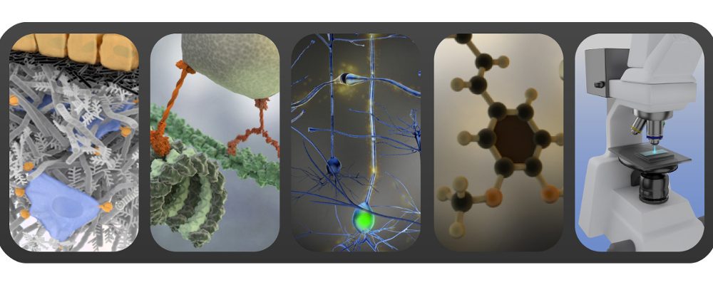
Figures and images in scientific poster design.
Perfection is finally attained not when there is no longer anything to add, but when there is no longer anything to take away. A. Saint-Exupéry
Visual flow is the way you guide a viewer through a poster so they look at the information in the order you want them to.

There are simple solutions to guide your viewer, for example, numbering or adding arrows to indicate the sequence. However, more subtle ways exist to achieve the same effect. One of them is careful choice and use of images:
- choose your images in such a way that they alone already tell your story;
- bear in mind that images create strong focus points on your poster so place them in such a way that the visual equilibrium is maintained and attention is drawn to the parts that you want to highlight;
- remember the “visual weight” sequence: plot < simple illustration < photo or photorealistic image. Colour images always “weight” more than black and white ones. Visually a photo will create a stronger focus than a plot or a schematic representation;
- look for natural directional elements in your images. If the directionality is strong and you place your images disregarding it, you may involuntarily make your viewer look off your poster and move on to the neighbouring one without even reading through one half of your introduction;
- link your images with the text by alignment or additional elements.


There is a tool graphic designers and scientists alike use a lot even though they don’t mean exactly the same thing. Grids. For a graphic designer, a grid is a division of a page into horizontal and vertical spaces taking into account margins, spacing between vertical columns and horizontal rows and spaces between blocks of text and images. Grids help to build the design in a logical, modular way and make it way more consistent. The decisions concerning the number of columns and/or rows, the spacings and margins are yours to make. This initial grid should reflect your intended visual flow and be in alignment with the quantity and the hierarchy of your information. Once you set up your underlying grid, be consistent in placing your elements on it. However, your grid is not cast in stone and elements can occasionally break out of it. An image or a text that overlaps a margin is an example of grid breaking and might be a way to add an extra focus to this element. Be careful though and always think twice why exactly you want to break out of the grid.

If you like the content of this blog, sign up to receive the latest posts on graphic design for scientists directly to your inbox!
Further reading on poster design:
Conference Poster Design: very thorough resource on every aspect of the poster design.
Better posters : many useful tips! On the downside, not always easy to find the interesting information.
Example of poster design workflow : nice description of a workflow for designing a poster.
Latex poster templates : good start for a nice poster designs if you master the Latex typesetting environment.
How to make posters no one remembers: all is said in the title …